Blog
Cultural Foundations of UX: Understanding Japanese User Behavior
Effective UX design starts with understanding the people you’re designing for. Culture shapes how users interpret information, navigate interfaces, and make decisions. That’s why a design that works well for a Western audience won’t necessarily work for an Eastern one. Culture significantly influences how we perceive the world and how we interact with technology. When we understand the cultural variables that shape our users’ perceptions, we can more accurately identify what needs improvement and design experiences that feel intuitive to them. After reading this article, you will gain insight into how deeply culture impacts UX design, and why a one-size-fits-all approach rarely works across different regions.
Written by
Máté Mracevic Papp
Last updated
DEC 08, 2025
Topics
#business
Length
5 min read

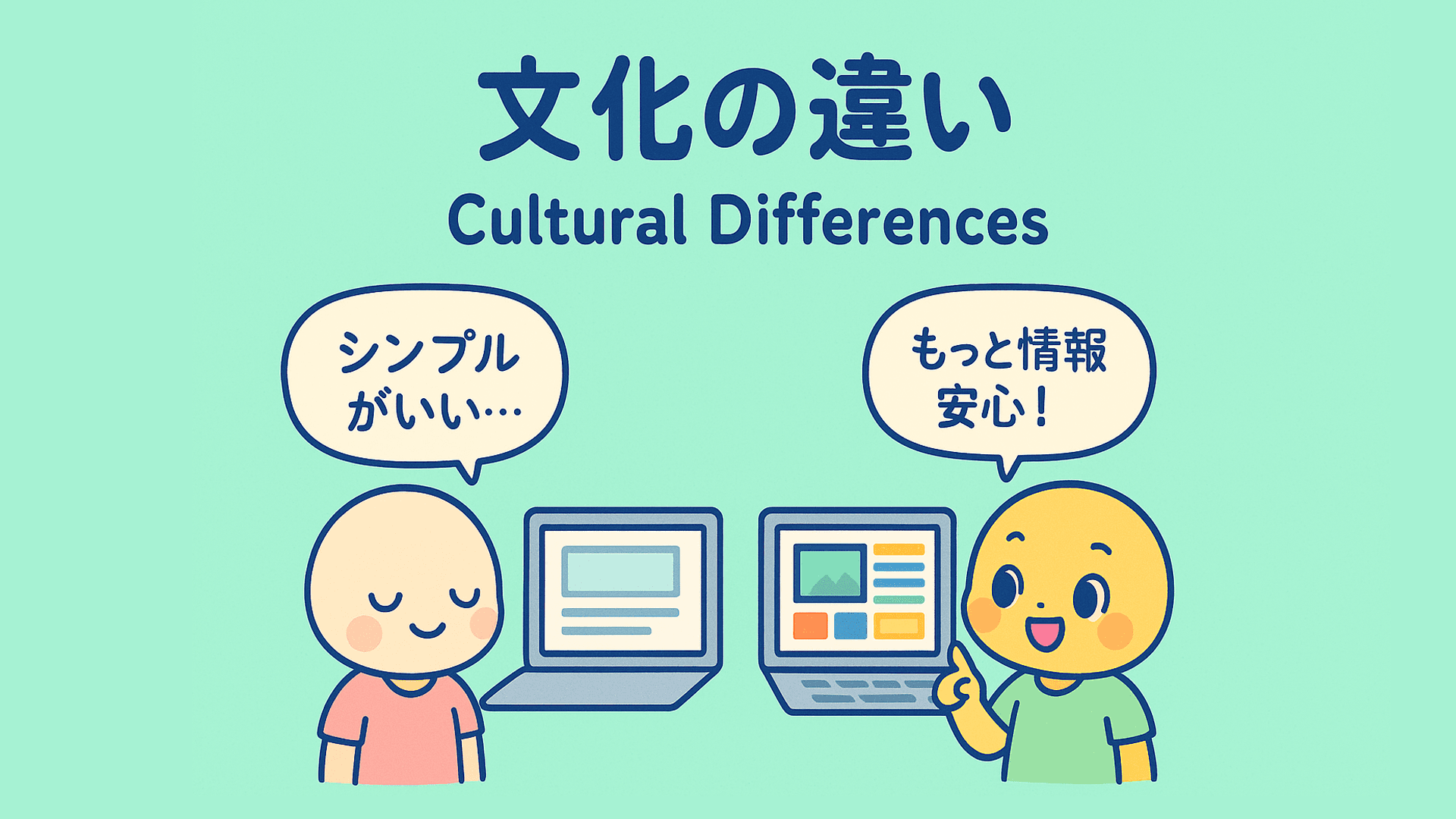
Communication Style Preferences
Understanding communication styles is essential when designing for different cultures. Western cultures typically use low-context communication, where meaning is conveyed primarily through explicit wording. In contrast, Japan relies heavily on high-context communication, where meaning is shaped not only by what is said but also by how, when, and in what context it is communicated.
In high-context cultures like Japan, people rely on shared social cues to interpret meaning in everyday communication, but digital interfaces cannot provide those cues. When interacting with a website, users cannot depend on tone of voice, relationships, or situational context to fill in the gaps. As a result, Japanese users expect interfaces to provide all the contextual information that a human interaction would normally supply. This leads to designs that include more details, supporting explanations, and visible credibility markers. In this way, high-context communication actually increases the need for richer information in digital environments, because the interface must supply the context that would otherwise come from social understanding.
This is why, in contrast to the Western “less is more” philosophy, where clean, simple designs are highly valued and cognitive load is minimized, Japanese websites often present far more details and text to avoid any misunderstanding. The heavier content can create an interface that feels busy or cluttered to Western audiences, yet it aligns perfectly with Japanese expectations for clarity and reassurance.
This tendency is reinforced by the Japanese writing system. Because Japanese uses three scripts - hiragana, katakana, and kanji - designers and developers must account for variations in text density. Kanji characters can convey complex meaning in a single symbol, but they often require more vertical and horizontal space than Latin letters. This affects layout planning, text spacing, and how much information can be displayed without compromising readability.
Uncertainty Avoidance
Japan ranks as one of the top most nations to avoid uncertainty. Because of this, UX design should aim to dispel any doubts that our users might have, by providing all the relevant information upfront. This design choice aims to solidify that what we are showing is efficient and trustworthy.
The only exception to this are brands with significant global presence because they don’t have to worry about proving credibility, for example Nike. (https://www.nike.com/jp/)

You can try and be creative with your design and text placements, but being so innovative is not recommended, especially for lesser-known brands, as a high uncertainty avoidance also means the user is less likely to be open to trying new things.
Power Distance: Hierarchy and Trust in Design
Japanese culture has a relatively high power distance, meaning hierarchy and authority are deeply respected. This cultural trait subtly influences UX expectations.
Users often look for indicators of credibility, legitimacy, and seniority. In design, this can be communicated through visual hierarchy, and by emphasizing institutional logos, expert endorsements, or official certifications.
Even tone and language play a role: polite, formal phrasing instills trust, while overly casual or playful tone may seem unprofessional. Understanding this helps designers create experiences that feel respectful and reassuring within the cultural context.
A Japanese corporate site like JBS shows how authority and hierarchy are signalled through formal language, structured navigation and visibility of leadership. (https://www.jbs.co.jp/) I recommend switching between Japanese and English to compare the obvious differences.
The 会社案内 (“Company Profile”) page reveals an organizational chart (PDF) and detailed company statistics: capital (¥539 million), employee count (2,839), and founding date.
The 役員一覧 (“Board / Executive List”) displays the president (代表取締役社長), board members, and executives individually, complete with their biographies, tenure, and shareholding.
The tone of the site is formal throughout: respectful language and corporate titles are used, reinforcing a professional and hierarchical corporate identity. Navigation is also quite structured, with clear sections for “History,” “Subsidiaries,” “Business Offices,” and “Certifications,” which emphasizes the organization’s scale and legitimacy.
This design strategy reduces ambiguity for users: by making leadership and company structure visible and transparent, the site cultivates trust and projects stability — exactly the kind of reassurance valued in a high power-distance culture.

Aesthetics and Symbolism
Design in Japan is not only functional but also deeply symbolic. Elements like color, balance, and flow carry emotional weight.
For instance, red and white often symbolize celebration and purity. Minimalist whitespace may convey elegance, but too much can feel empty or cold. Symmetry and order reflect respect for harmony, a key cultural value.
Japanese aesthetics blend the traditional with modern precision. For UX designers, this means that beauty in Japanese design is not always about minimalism rather it’s about balance and meaning.
The Muji site is a prime example of how Japanese aesthetics emphasize harmony and symbolic meaning: the minimalist layout, careful typography and muted color palette reflect deeper cultural values of calm, balance and refinement. (https://www.muji.com/jp/ja/store)

Conclusion
Japanese UX isn’t just different — it’s deliberate. It reflects a culture that values harmony, precision, and trust.
When designing, keep in mind that the task is not to impose our own cultural logic, but to listen, learn, and adapt, turning intercultural understanding into user experiences that truly connect.
Scriptide is a highly skilled software development company that specializes in custom, complex B2B software solutions. We offer a wide range of services, including digital transformation, web and mobile development, AI, blockchain, and more.
Get a free IT consultation. We are excited to hear from you.
You might also like these articles!
Click for details
Japan’s IT Sector in 2026
As Japan steps into 2026, its IT sector is quietly transforming. Companies face growing pressure to innovate, yet a persistent shortage of skilled professionals is slowing the adoption of key technologies like public cloud and AI. Without the right talent and strategies, organizations risk falling behind in an increasingly digital and interconnected global economy.
#business
•
JAN 20, 2026
•
4 min read
Click for details
From Market to Partner: Insights from Scriptide’s Founders on Japan
Scriptide has been active in the Japanese market for five years. Following their latest business trip to Japan, we spoke with CEO Daniel Fazekas and COO Tamas Fazekas, the company’s founders, about their experiences, impressions of Japanese business culture, and why they see Japan as such an important market. During their stay, they attended the Japan–Hungary Business Forum, visited the Novare Innovation Center, and explored the site of the upcoming World Expo in Osaka.
#business
•
OCT 03, 2025
•
8 min read